The Future is Here.
Project Overview
The Product:
The Bella Sensor System is a mobile diabetes tracking app for individuals with Type 1 and Type 2 diabetes. The app focuses on the health of the user and the ability to customize notifications. Bella Sensor System also has a Responsive Web Design to view products on multiple devices.
Project Duration:
July 2022 to September 2022
The Problem:
Individuals with diabetes struggle to find a tool that makes them feel safe and comfortable. This led to the creation of the 911 calling feature. The Bella Sensor System has identified a lack of data that users are missing out.
The Goal:
Design an app that will improve the lives of individuals with diabetes and help them feel safe when left alone.
My Role:
UX designer leading the app and responsive website design from conception to delivery.
Responsibilities:
Conducting interviews, paper and digital wireframing, low-fidelity and high-fidelity prototyping, conducting usability studies, iterating on designs, determining information architecture, and responsive design.
User Research
Summary:
I extensively interviewed my sister, who has Type 1 diabetes, and searched competitors on what areas they were lacking in. While doing user interviews, my sister as well as competitors were feeling unconfident in their abilities to live alone while having diabetes. The feedback received through research made it very clear that users would be open and willing to work on finding ways to feel more confident if they had a tool to help guide and aid them.
Persona 1 - Katherine
Katherine is a working professional who needs data about her numbers, 911 calling capabilities, and to be confident at home alone because she works remotely.
Persona 2 - Dave
Dave is a high school student who is always using new technology and needs the new gadgets that come out, he wants to customize areas of notifications and use the tool on multiple devices.
Competitors
Dexcom
About:
Dexcom is a sensor company that focuses on giving the user notifications when their numbers are either low or high. The sensor context to users device every five minutes.
Cons:
Sensors need changed more often
No calling EMT feature
Minimal data information available
Showing paid spokesperson on website
Produce inaccurate glucose readings based on reviews
Pros:
Consistant glucose monitoring
IOS and Android compatible
Data share up to 10 people, including healthcare professionals
Simplistic design
FreeStyle Libre
About:
FreeStyle Libre is a sensor and softwarre that alows users to test blood sugar levels. It offers notifications in cases of high and low blood sugar levels. The branding of the company is minimal put pushes their marketing towards families.
Pros:
Current glucose readings with a text to speech option
Glucose history capabilities
Save and Add notes to your data
Cons:
In a study, 40% of users found their numbers to be inaccurate by 40+
No alert functions for high and low glucose numbers
FreeStyle Libre is not connected to other devices to enable data sharing
Ideation
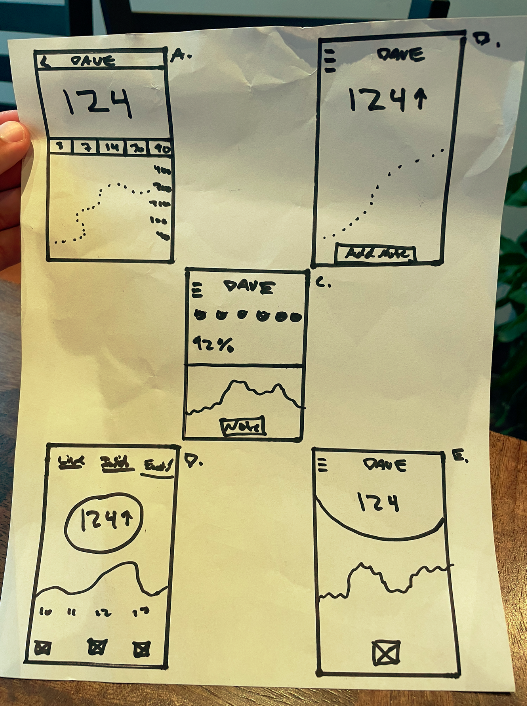
I did a quick ideation exercise to come up with ideas for how to address the gaps identified in the competitors. My focus was specifically on detailed data tracking and the home screen landing.
Digital Wireframes
After ideating and drafting some paper wireframes, I created the initial designs for the Bella Sensor System app. These designs focused on providing detailed data information and 911 calling settings.
Low-Fidelity Prototype
To prepare for usability testing, I created a low-fidelity prototype that connected the user flow of viewing live glucose numbers to data insights, into events high and low that has happened to the user. I have also added a calling 911 feature that can be turned off and on.
Usability Study Parameters
Study Type:
Moderated usability study
Participants:
4 participants
Location:
Rosemount, Minnesota & Saint Paul, Minnesota
Length:
15 - 20 minutes
Usability Study Findings
These were the main findings in the usability study:
Mockups
Based on the insights from the usability studies, I applied design changes like providing A1C level information on the Insights screen.
Before usability study
After usability study
Mockups Continued
High-Fidelity Prototype
The high-fidelity prototype followed the same user flow as the low-fidelity prototype, including the design changes made after the usability study.
Accessibility Considerations
Clear labels for interactive elements that can be read by screen readers.
2. Initial focus of the home screen giving personalized recommendations help define the primary task or action for the user.
Sitemap
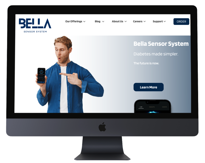
With the app designs completed, I started work on designing the responsive website. I used the Bella Sensor System sitemap to guide the organizational structure of each screen’s design to ensure cohesive and consistent experience across devices.
Responsive Designs
The designs for screen size variation included mobile, and desktop. I optimized the designs to fit specific user needs of each device and screen size.
Mobile website
Desktop website
Next Steps
Conduct research on how successful the app is in providing accurate data for users
2. Add more educational areas for users about diabetes and possibly some games
3. Provide a reward system for users who have good numbers for a 30 day period of time
Takeaways
Impact:
Users shared that the app made glucose tracking easy and insightful. The detailed graph information and ability of 911 calling capabilities made the users feel more confident.
What I learned:
I learned that even though the problem I was trying to solve was a complex one, diligently going through each step of the design process and aligning with specific user needs helped me come up with solutions that were both feasible and useful.
Let’s Connect!
Thank you for reviewing my work on the Bella Sensor System app!
If you’d like to see more, or get in touch, my contact information is provided here.


